Print
Choosing colours for your project or the colours for a border can often be the hardest part – particularly with some yarns where there is a large variety of colours available. And of course it becomes even harder when you are making a project with several colours or variegated yarn.
Below are some of the things that I have learnt over the last few years from reading about colour theory, attending workshops and my own experience, that I thought you would find useful:
- Be clear on the objectives—what feeling do you want to create, what colour schemes will the finished item be with? Colours create emotion:
| Yellow – brings energy. |
Blue – imbues trust and is calming. |
Brown – brings comfort. |
Red – stimulates the senses,
is passionate and aggressive |
Green – considered to be growing and good. |
Purple – brings mystery and a sense of regalness. |
|
Orange – warm and cozy |
|
- Odd is best — use an odd number of colours, eg 3,5,or 7. Using 5 works well.
Select three colours from a group (see below) plus a neutral and a complementary.
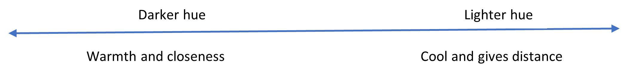
- Try to use 3 hues of colour – light, medium and dark. Light at the top and dark at the bottom, as this is easier on the eyes.Projects often need both to bring harmony.
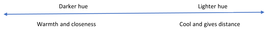 Once you’ve selected the colours, order them from light to dark (the hues) and check that you have the three hues. You can of course use all the same hues, but having all three brings more depth to your project.
- Using white with colours will help other colours stand out.
- Using black with colours will dull other colours.
- Using grey will enhance the other colours used.
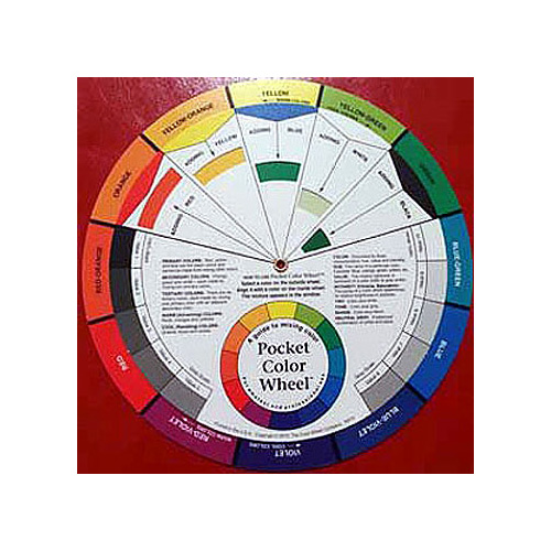
- Use a colour wheel to select colours:
- If blending or harmonising – select colours from the two wedges either side of the main colour.
- If contrasting– select colours from directly across from the main colour.
- If looking for a difference – select colours that create an equilateral triangle on the colour wheel (every fourth colour) or tetrads or the split complementary combinations ( these are generally marked on the wheel).
- Don’t avoid colours that you don’t like—they can often enhance the colours that you do like, and can look good when combined with other colours.
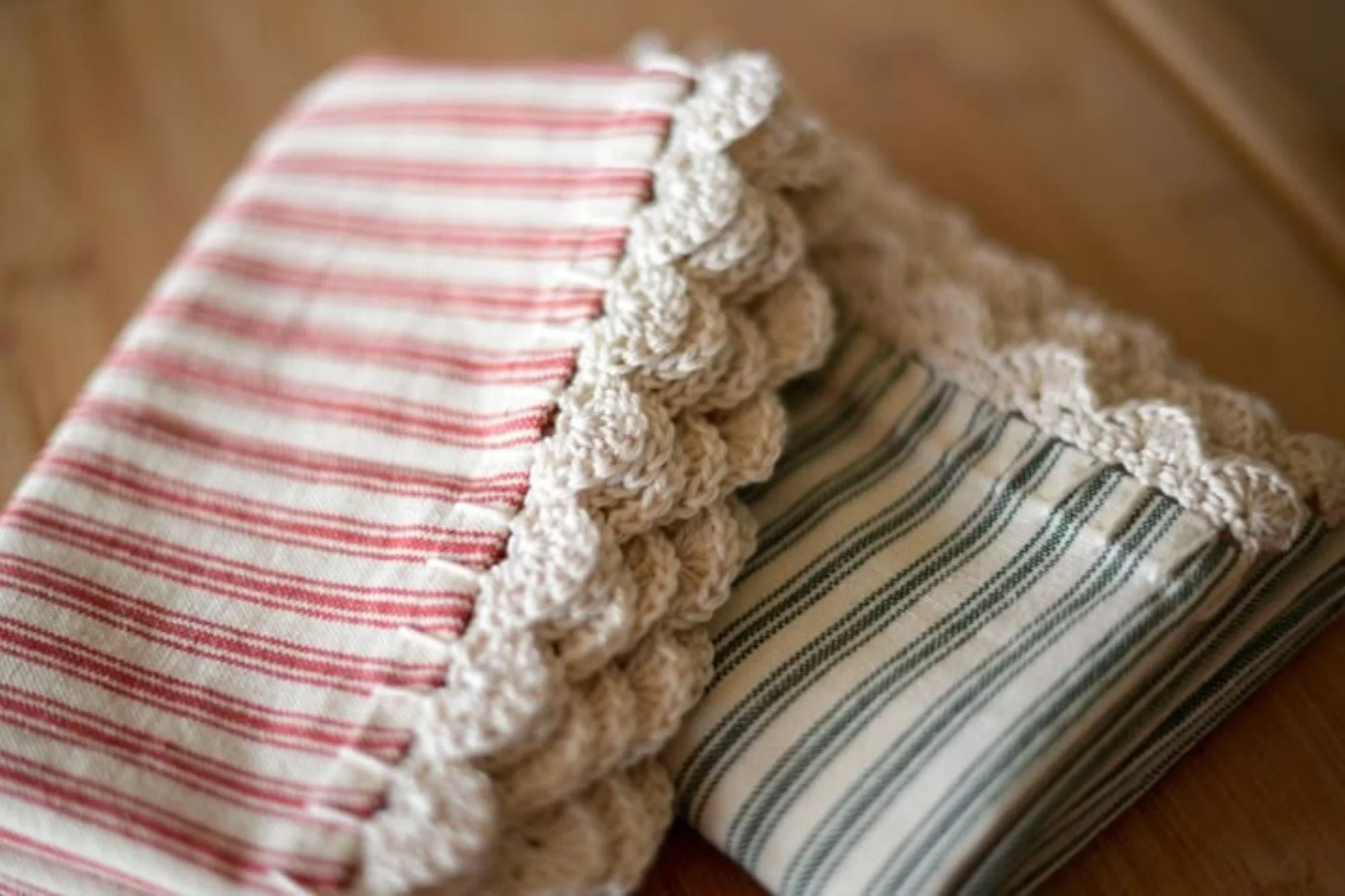
- If you are selecting colours to add a border/edge, your objective may be different:
- Select a colour to bring out one of the colours in the main piece – particularly where you are using a variegated yarn or many colours. OR
- Select a contrasting colour to frame the main piece.
Some points about the process when you are selecting colours:
- Take a photo of selected colour combinations. A photo often enables you to see the colours together in a different lightand you can see what catches your eye to challenge whether it is the focus point you want.
- While colour can impact mood, your mood can also select your colour choices, be conscious of what mood you are in and the mood you want to achieve from the project. You may even need to consider colour choices on another day.
- Seek help…ask friends or shop assistants what they feel from the colour combinations you’ve chosen.
 Once you’ve selected the colours, order them from light to dark (the hues) and check that you have the three hues. You can of course use all the same hues, but having all three brings more depth to your project.